
This is a photo edited in Photoshop CS4. I made a duplicate of the photo so there was two layer. Then I manipulated the background the black and white. Third I used the color range tool to select the yellow so it will stay yellow and stand out. I decided to do this so the the yellow of the beware sign will stand out and attract more audiences. This might make the audience like this photo more because the yellow makes the sign seem more to have more importance and will have a bigger effect on the audience.
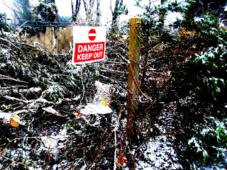
This is an edit from the previous post. I have edited this photo on Photoshop CS4. I have cropped some of the picture so their isn't any boring space that the audience will dislike. I have also made the photo brighter so its easier to focus on detail in the fore ground and background. This will make the audience like this photo more because they can get more information from the photo. By making the photo brighter it attracts the focus even more on the bright red sign.
This is a edit from the previous post photo. I have edited it in Photoshop CS4 . I have manipulated the brightness and contrast to end up with the light colors standing out and the darker making the the photo seem more dromatic. I have done this so it will have more of an effect on the audience than the old photo. I think making the photo brighter it will attract the focus more on the sign.
